Jio Discomm

Designing the Core Usage Experience for Energy Transparency

COMPANY

Jio

ROLE

Sr. Designer

EXPERTISE

Interaction & Visual Design

YEAR

2024

Jio Discomm

Designing the Core Usage Experience for Energy Transparency

COMPANY

Jio

ROLE

Sr. Designer

EXPERTISE

Interaction & Visual Design

YEAR

2024

Project description

Jio Discomm is a B2B2C energy app that helps homeowners monitor and reduce electricity usage. I joined midway to design the core Usage feature, simplifying complex data into clear, actionable insights ~ despite a tight timeline and no formal research phase.


📍 My Scope in the Product
The app spans multiple features, from monitoring and billing to energy insights. I led the design of the Usage and Appliance sections, which form the core of how users understand and manage their consumption.

💪🏼 The Challenge

How might we help users clearly understand their energy usage so they can make informed, cost-saving decisions?

Process

With no dedicated research phase, I collaborated closely with internal stakeholders (Product and Energy Ops teams) and analyzed proxy data to define user needs and mental models.

Process

With no dedicated research phase, I collaborated closely with internal stakeholders (Product and Energy Ops teams) and analyzed proxy data to define user needs and mental models.

🧩 Understanding User Pain Points

Through stakeholder discussions and app usage analysis, we mapped core user challenges:

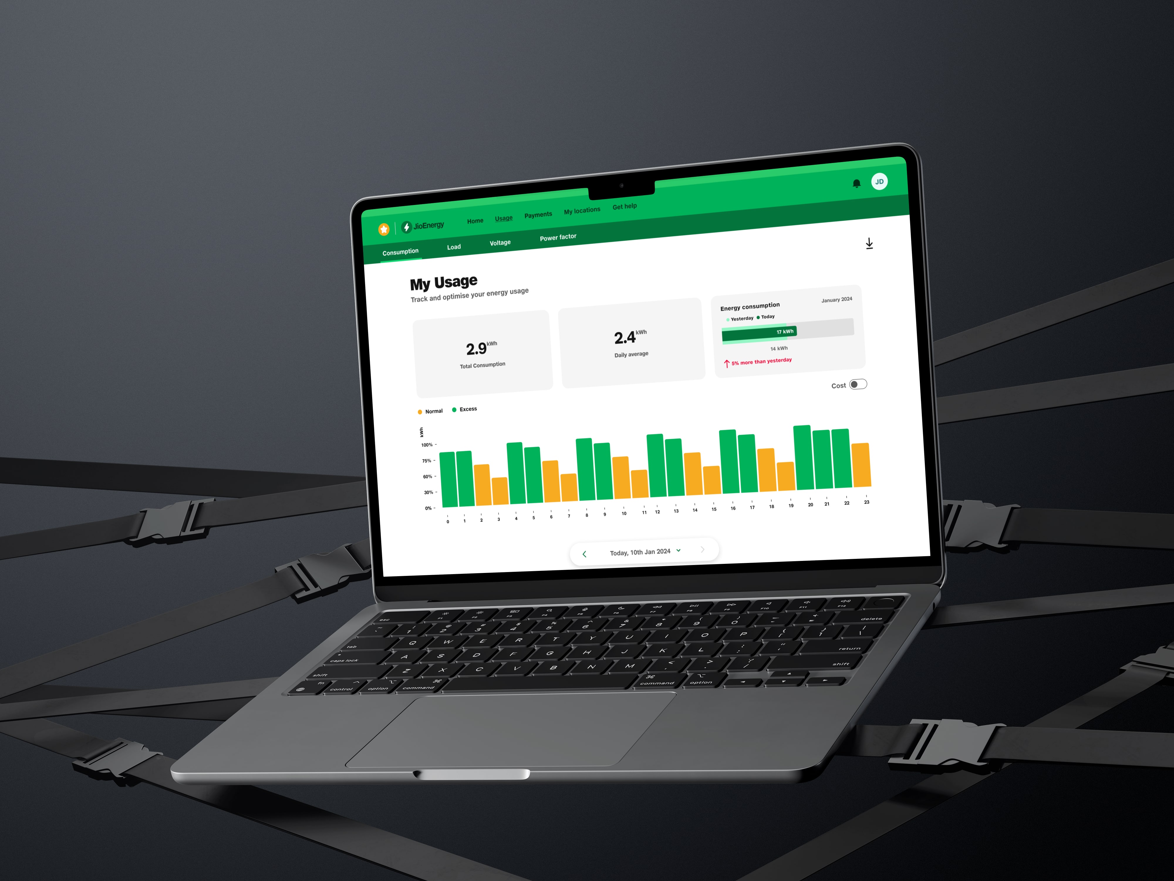
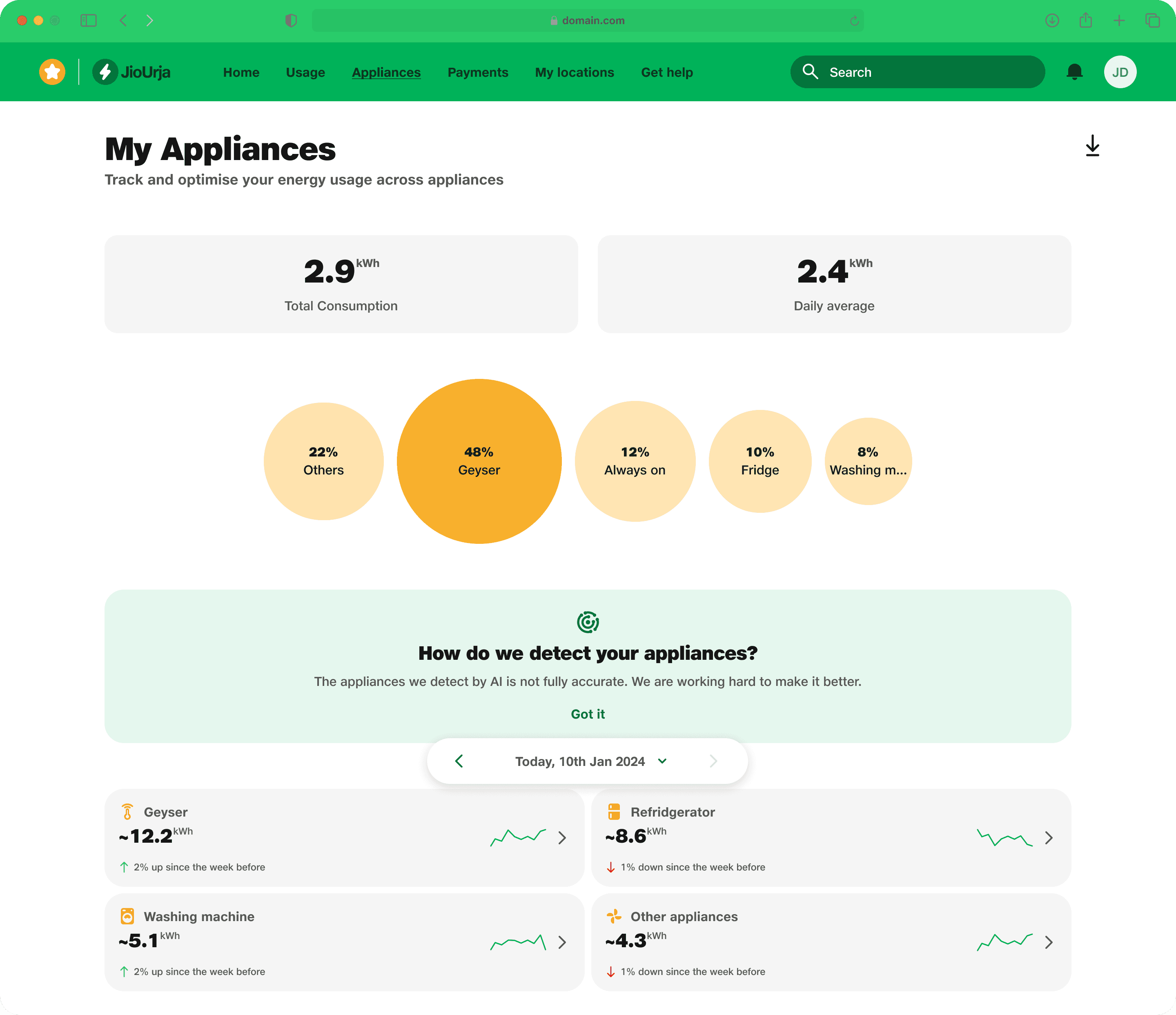
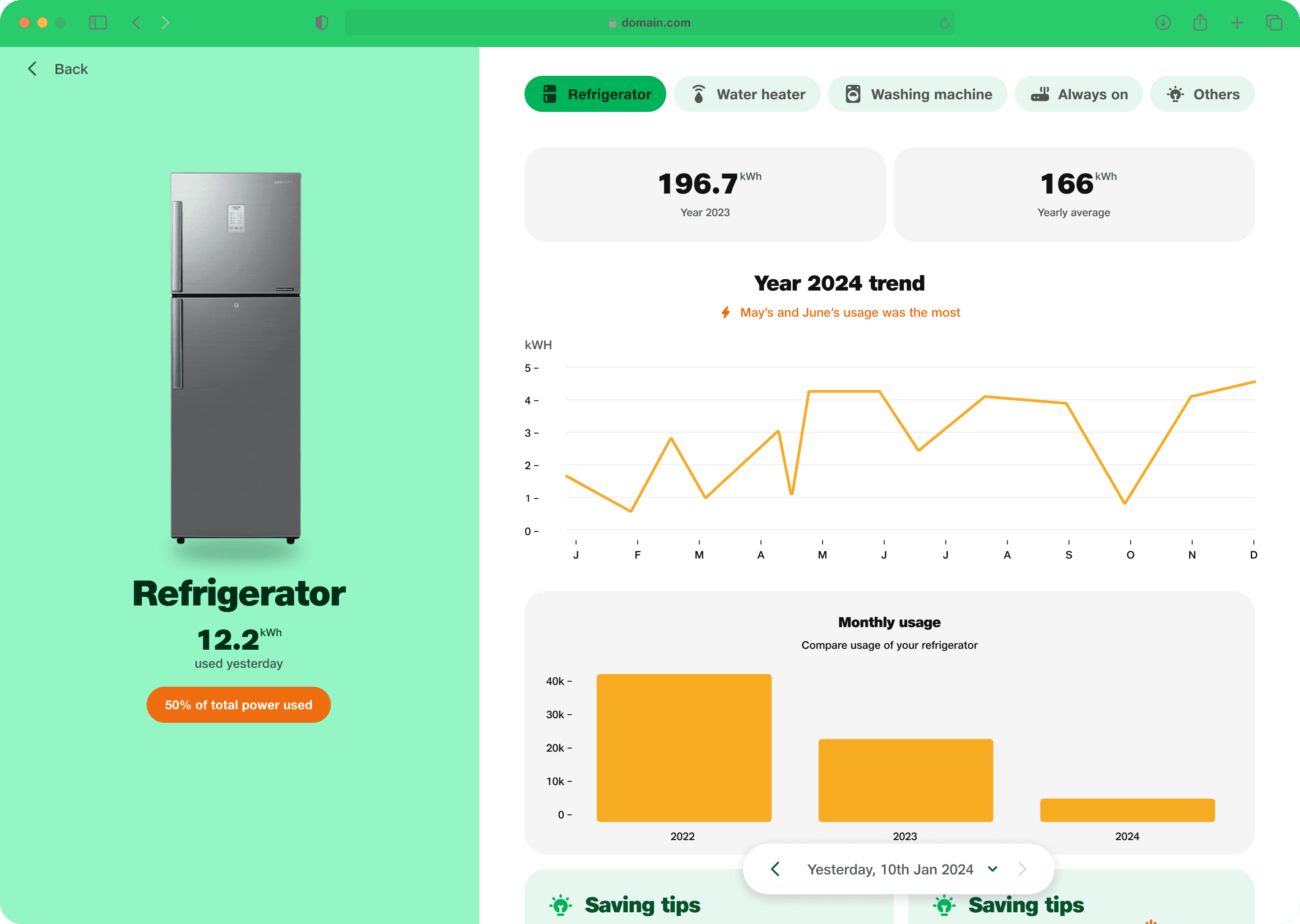
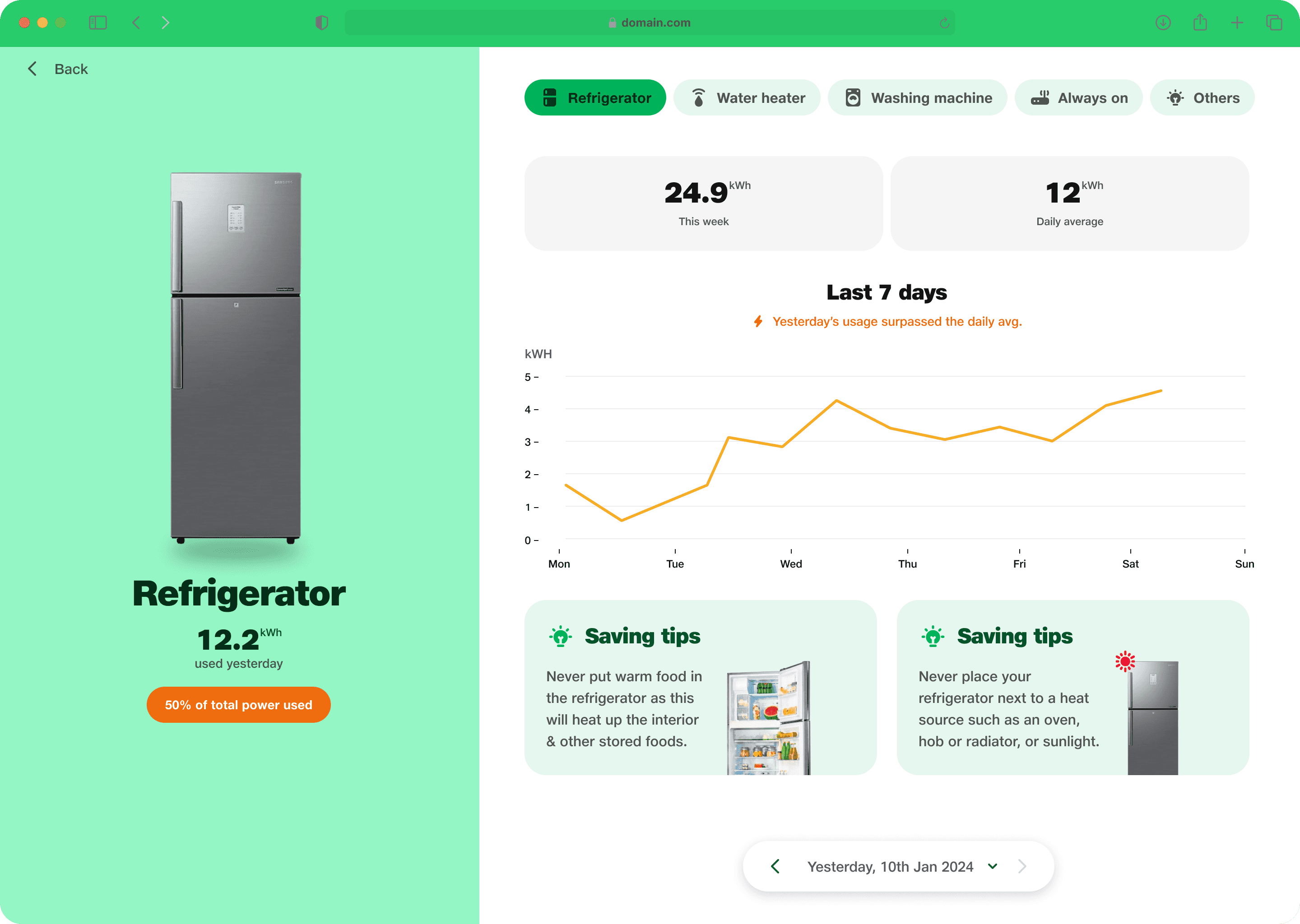
  • No appliance wise breakdown

  • Technical metrics felt unclear

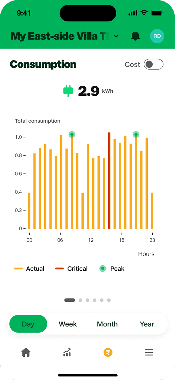
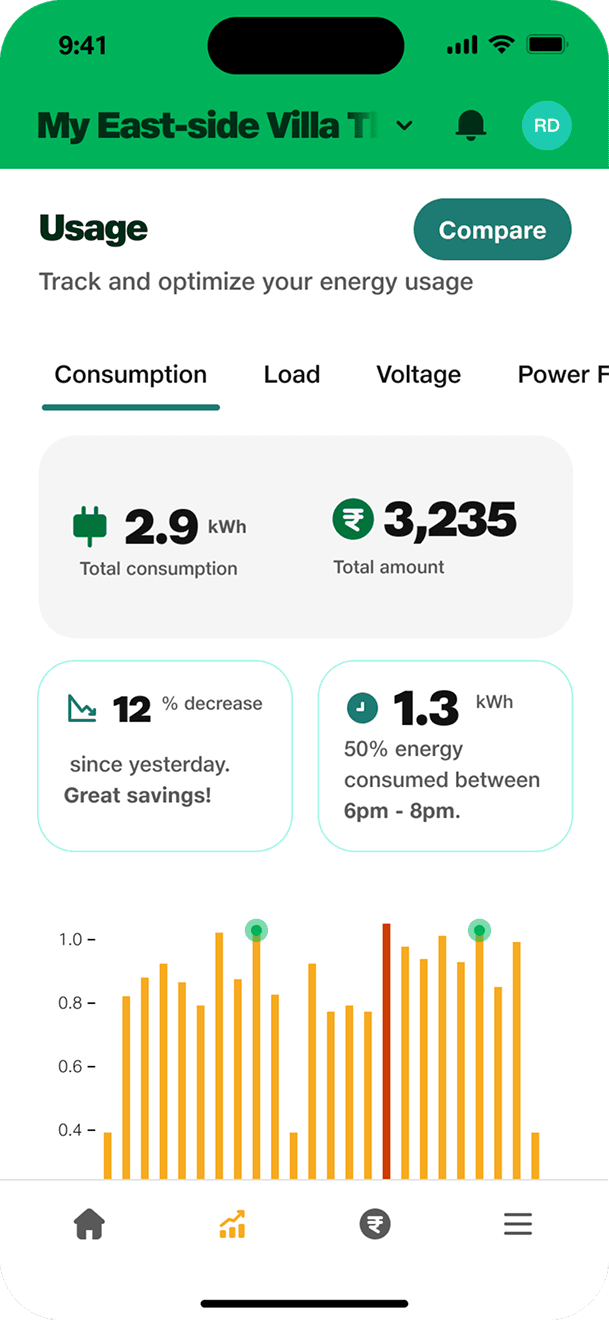
  • No visibility into usage trends

  • No benchmarks or alerts to guide action“I only know I’ve overspent when the bill arrives. By then it’s too late.”

🧠 Information Architecture Exploration

Option 1: Horizontal Scroll

  • Clean, linear experience

  • ❌ Not scalable for future features

  • ❌ Hard to predict what's next

Option 2 ✅: Tab-Based Navigation

  • Familiar and focused

  • ✅ Easy to scale

  • ❌ Requires extra taps

We chose Option 2 for better clarity and long-term scalability.


IA - Option 1

IA - Option 1

IA - Option 1

IA - ✅ Option 2

IA - ✅ Option 2

IA - ✅ Option 2

Solution

We divided the solution and design in two phases.

Phase 1: Usage Monitoring (Consumption, Load, Voltage, Power Factor)

✅ Key Features Designed

  • Time filters: Daily, Monthly, Yearly views

  • Graph modules: Reusable graphs across 4 energy metrics

  • kWh/Cost toggle: Helps users relate usage to bills

  • Downloadable reports: Useful for power users and landlords

  • Comparison with similar homes: Sets a behavioral benchmark

🔁 Iterations

  • To avoid overwhelming users, we used progressive disclosure: key metrics first, then deeper insights.

  • A modular calendar + graph system was created for reuse across multiple tabs.

Energy usage video

Live monitoring video

Energy usage video

Appliance Monitoring video

Appliance Monitoring video

Appliance Monitoring video

Appliance Monitoring video

Impact & Learnings

💡 40% boost in appliance screen engagement
🕹️ 25% used Daily/Monthly toggle on first use
🧩 Calendar module reused in 2+ products
Users reported better awareness of energy patterns

✨ Learnings

  • Designing for non-technical users in an energy-heavy space requires radical simplification.

  • Reusable components, like modular graphs, speed up delivery across multiple features.

  • Even in short projects, aligning with user mental models improves usability dramatically.

✅ Summary

This project gave me the opportunity to step in midstream and take ownership of two essential experiences in a live product. Despite tight constraints, we delivered high-impact features that translated complex energy data into user-friendly, empowering tools—making sustainable energy choices easier for thousands of users.

5% reduction

in overall churn rate in Rajasthan.

10% increase

in seller posts over a period of 1 week

13% fewer

Onboarding support queries

~6-8% increase

in granting locationpermissions