
📴 Common System Issues After Adopting Solar
These were patterns observed across apps and ecosystems that hindered effective monitoring:
Data refreshed only every few hours, not in real-time
Complex graphs and poor visual hierarchy
Lack of system alerts for faults or low generation
Inability to compare historical performance easily
🎯 Goals:
To be self-sufficient in their energy needsTo use all devices without power interruptions
To generate savings and reduce long-term energy costs
To reduce carbon footprint and participate in green initiatives
💡 Motivations:
Rising cost of electricity
Government subsidies that reduce initial investment
Owning an EV and reducing its charging cost
Desire for energy independence and a cleaner lifestyle
💬 User-Expressed Pain Points


I don’t understand what these numbers mean
I am unable to
locate faults or troubleshoot easily
The app shows too much in one go. I just want to know the basics.


I never know if something’s gone wrong unless I see a drop in the bill.

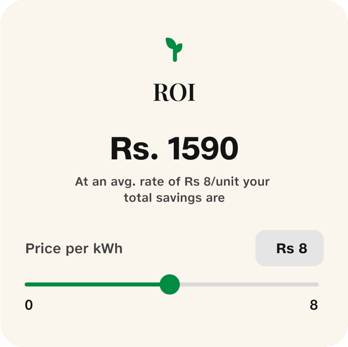
I wish there was a way to know savings and ROI over time.
Solution & Design
We structured our solution around four pillars:

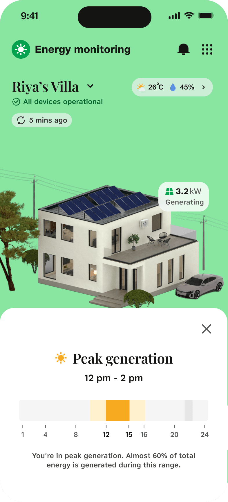
2. Historical Insights
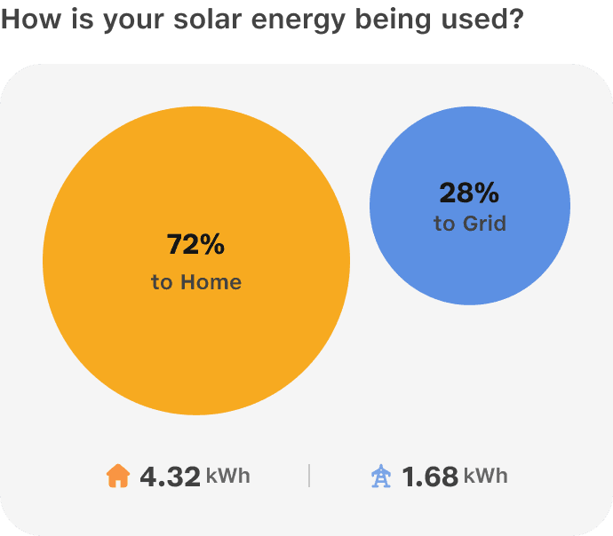
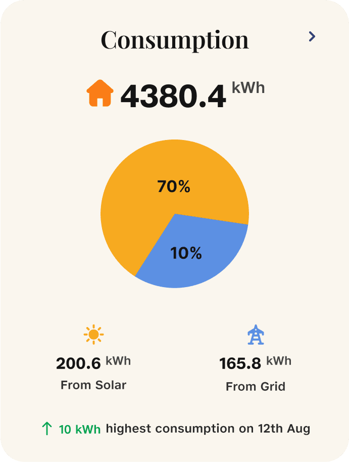
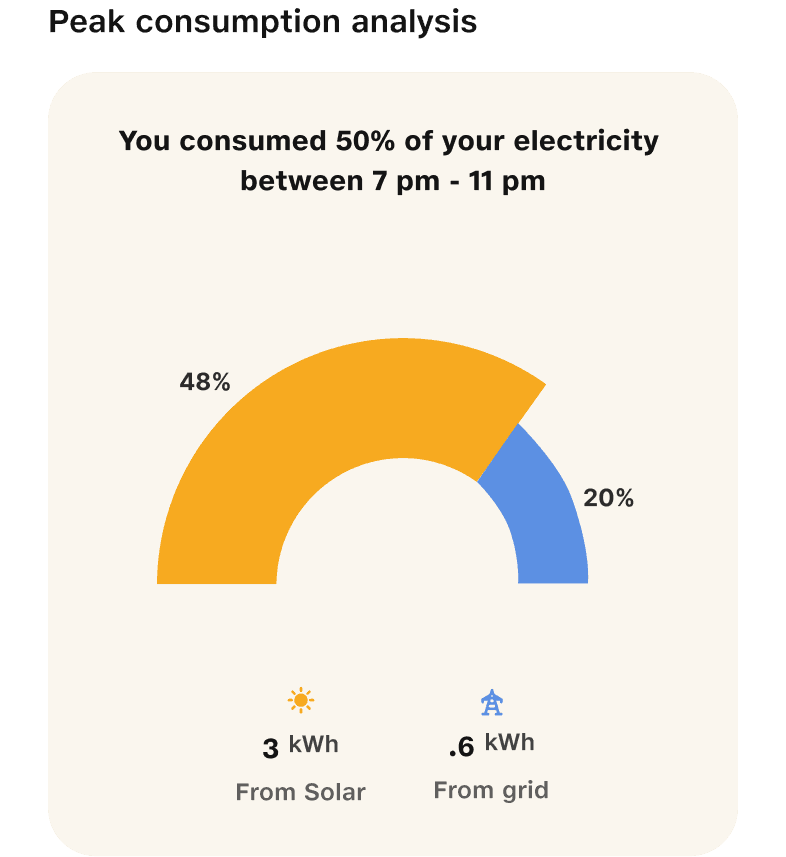
Graphs showing daily, monthly, yearly data
Highlights peak usage times and comparative trends
Helps users understand generation vs consumption behavior
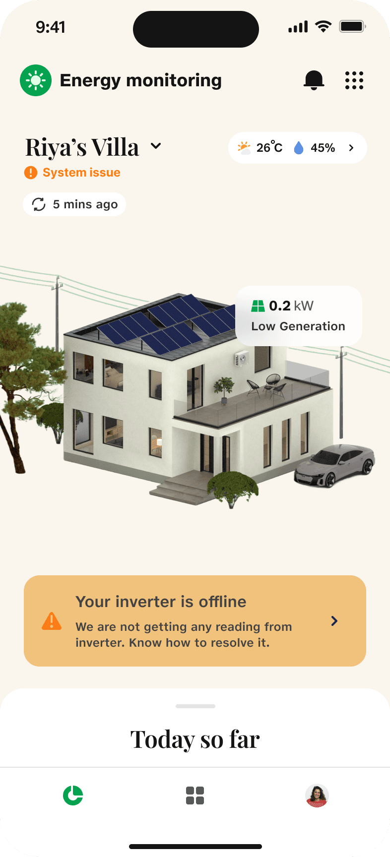
3. System Management
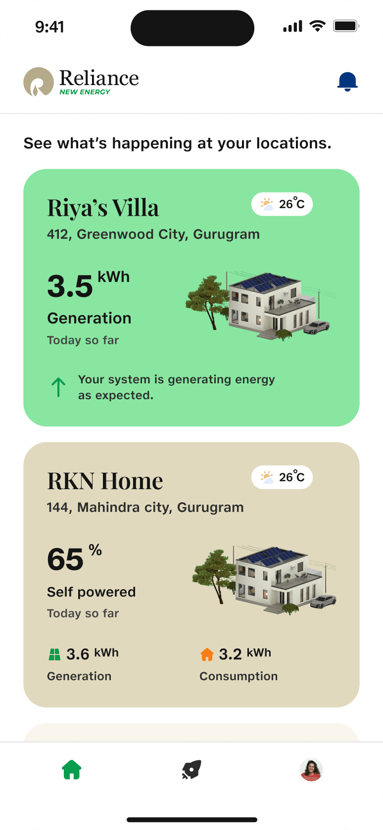
Support for multiple solar locations
Asset health status with fault alerts (e.g. inverter offline)
Contextual weather updates and recommendations (e.g. "Do energy intensive tasks from 12–4 PM")
4. Support & Troubleshooting
Easy access to system details, performance insights
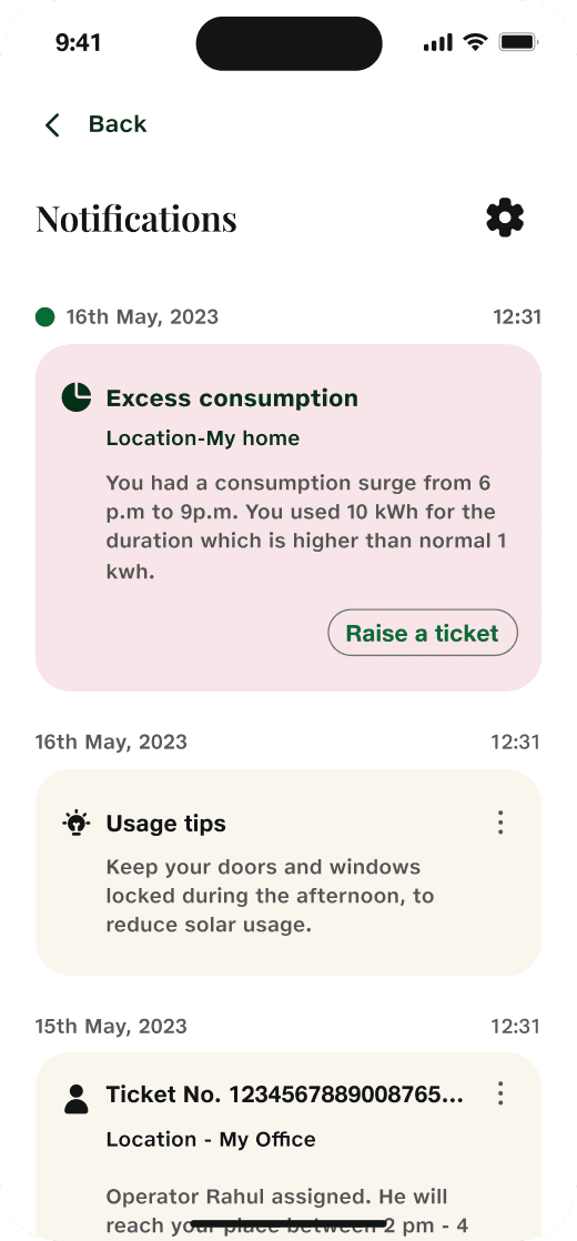
Alert center for issues and reminders
Testing at REI Expo
At REI Expo 2024, we tested our solar monitoring app prototype through 21 in-person interviews with installers, new users, and industry peers. The goal was to validate core assumptions, understand usability gaps, and gather real-time feedback from potential users. The testing surfaced both encouraging patterns and clear areas for improvement:
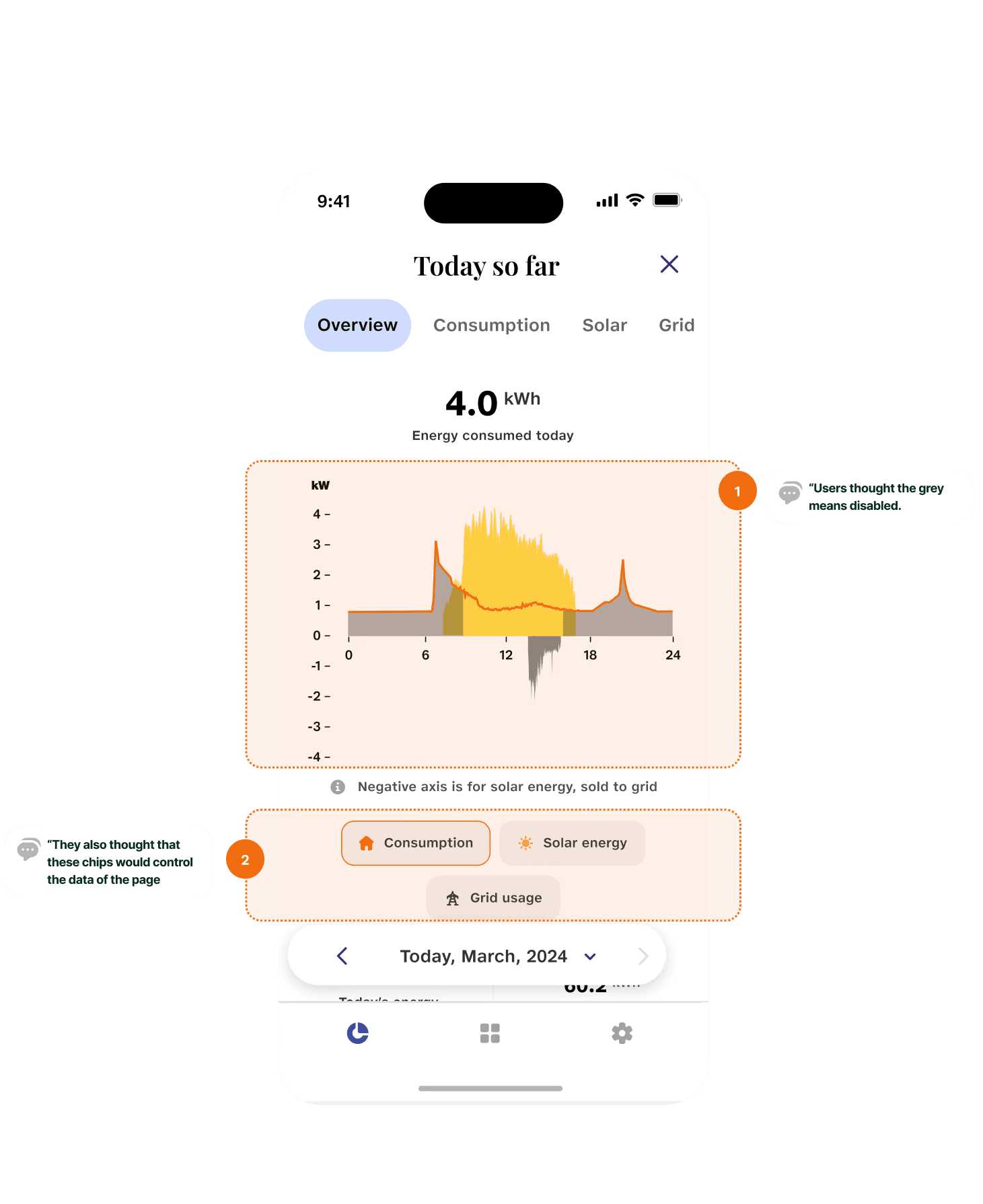
❌ Pain Points & ✅ Fixes:
🚫 Issue | 💬 Feedback | 🔄 Fix |
Graph colors | Grey confused users | Used clearer, intuitive color coding |
Chips | Users expected page update, not just graph | Improved toggling behavior and labels |
Alert messages | Static welcome message didn’t resonate | Replaced with real-time system status |
Grid icon | Confused users | Updated to more relatable visuals |
Summary view | Visually lost in layout | Reworked hierarchy and spacing |
Final Design
Before finalizing this version, we saw a significant shift in direction. The solar monitoring app evolved into a multi-service super app to support Battery Swap and EV Charging in addition to solar. This required foundational design and architecture changes:
📲 Redesigned the dashboard to act as a central console across energy services
🔋 Introduced modules for Battery Swap and EV Charging with reusable UI patterns
🧩 Reworked navigation and tabs to accommodate multiple services while keeping clarity
But for the scope of this case study, I am limiting it to solar monitoring. Let's have a look at the changes.
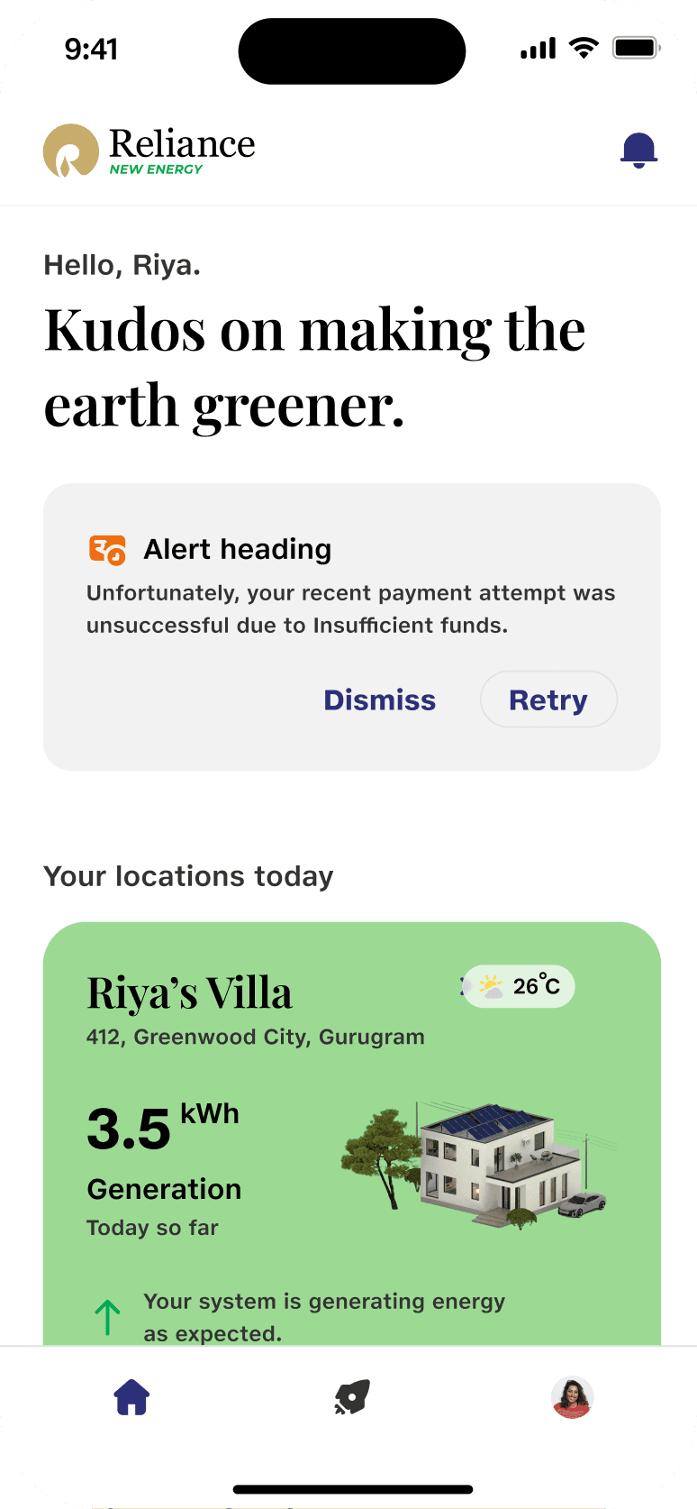
🧭 Dashboard:
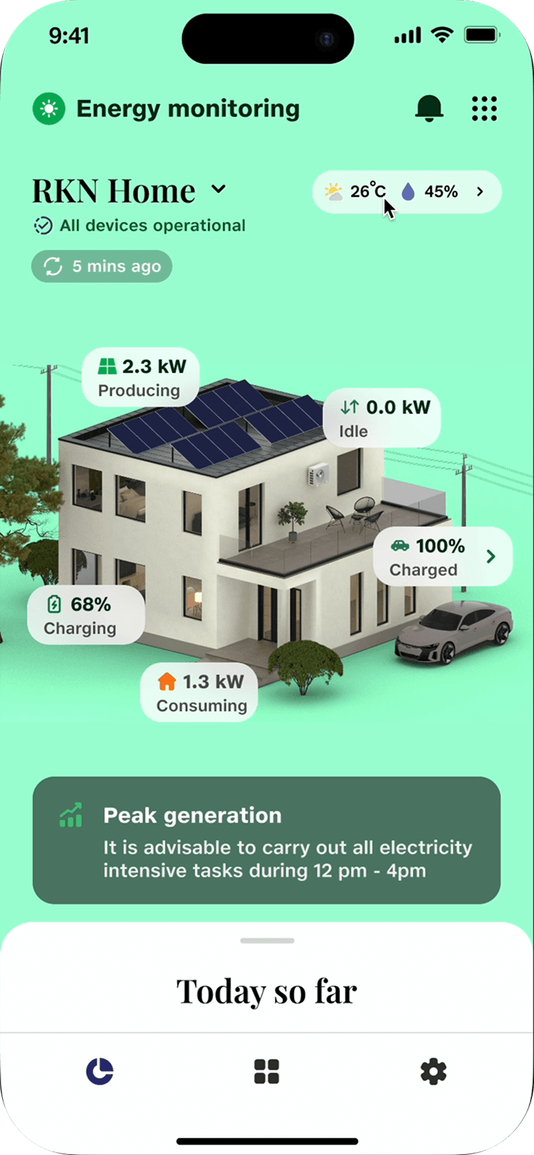
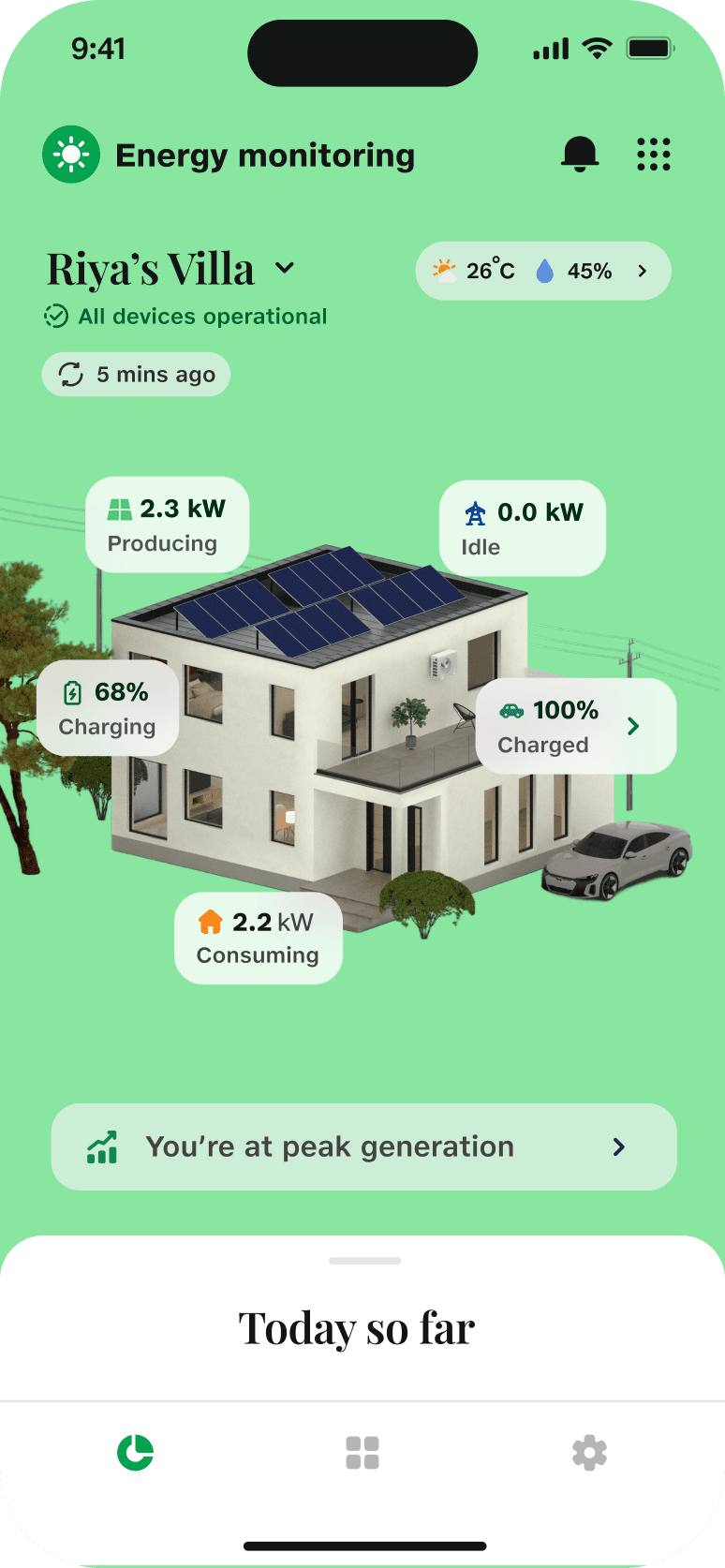
❌ Before: Notification tray distracted from Today so far. and the grid icon was not understandable by users.
✅ After: Tray visually softened and relatable icon for grid added.

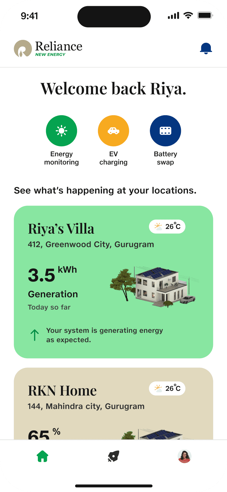
🏠 App home Overview:
❌ Before: Generic messages and alert banners pushed location cards down; only one location visible.
✅ After: Personalized welcome; two locations visible in the first fold; added Battery Swap and EV Charging modules.
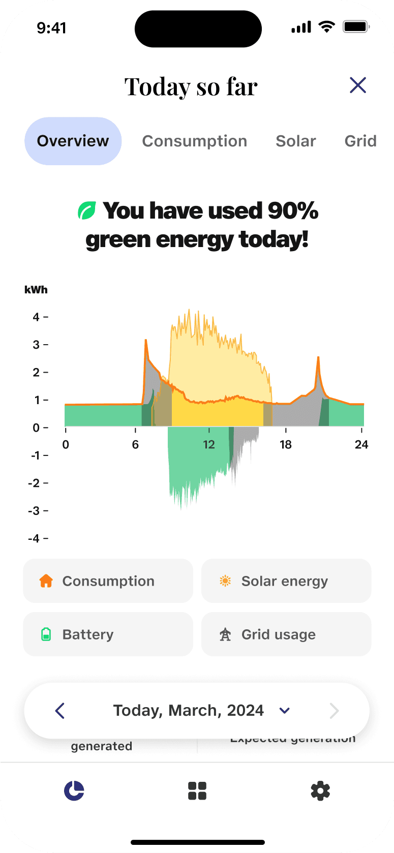
📈 Graph Overview:
❌ Before: Redundant data, unclear toggle behavior, and confusing color coding.
✅ After: Clear legends, intuitive toggles, and improved visual hierarchy for better data comprehension.

Impact & Learnings
✔ Real-time Visualization Users can now monitor energy in real time across solar, grid, battery, and home.
✔ Alerts & Troubleshooting Inverter faults, low generation, payment failures now immediately notify users.
✔ Net Metering Integration Users can see how much energy they export/import and optimize their energy usage accordingly.
✔ Daily & Historical Insights Users can view peak generation times, savings, and month-over-month comparisons.
✔ Higher Engagement
"We check the app daily now just to see how we’re doing!"
⏳ If I Had More Time
Explore appliance-level energy breakdown
Design a web dashboard for installers or commercial users
Add gamification (energy challenges, CO2 milestones)